|
I was recently reading an article (http://slowboat.com/2018/07/trusting-your-sources/) on Slow Boat regarding trusting your sources that highlighted the author’s experience in navigating into a small anchorage in Southeast Alaska. The article is a good read and the topic of knowing the source for your navigation data is an important one that I will definitely address in a future post. However, this post is more about an issue that they pose in their article and which I’ve seen plenty of confusion on it the past. As the title may suggest, that is the scale of the chart they are using. Scale is a very important, though often misunderstood aspect of any nautical chart. I attempted to post a reply to their article discussion regarding, but it never appeared (probably through my inept use of their comment system, that required me to create a login and wasn’t the most intuitive). In their article they state the following: The charts are…just wrong. As we mentioned before, the NOAA raster chart is the source for both Garmin and Navionics, and the errors in the NOAA chart show up in both. The east entrance is actually a disaster – super shallow due to reefs and eelgrass growing up to the surface. The west entrance, on the other hand, has a nice wide-enough channel in a straight line with a depth of over 9 feet at zero tide. They are referring to the charted small bay below, which I would agree is not the best depiction of the actual bay, which is pictured underneath the chartlet. However, the NOAA chart is not wrong, it is simply the wrong scale to be used for navigating into this harbor. The chart symbols for ledge happen to be larger than the width of the opening at the scale of the chart and as such they intersect. This chart was never intended to be used for safe navigation into the back of Vixen Harbor. A chart suitable for navigating such a small bay would need to be a much larger scale and, given the extremely light traffic that will be using this cove, it is extremely unlikely that NOAA would invest in creating a chart for this area at a 1:5,000 scale. 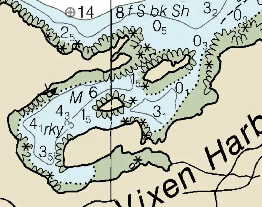  The scale of their chart is something that most recreational boaters very rarely take into consideration. It’s very easy to forget that the chart data has a scale when you’re using electronic chart plotters; indeed many professional mariners fall into this trap as well. Just because you can zoom into 1:500 scale, doesn’t mean the chart data will support it. More than likely, that data was collected at a scale of 1:10,000 and the chart was compiled at 1:40,000. A rock symbol on a chart is about 4mm (1/8-in) when printed; that means that at a scale of 1:40,000 that’s equivalent to 160-m (525-ft)…that’s twice the length of the ship I sailed on. Even at 1:10,000 that’s a rock that’s 40-m (130-ft). That’s a point feature that could actually be 1-m in reality; one rock symbol could encompass several rocks. In fact, if you consult the source data for the chart, the surveys of Vixen Harbor do indeed depict the area similar to how the describe it in the article. Both the smooth sheet sounding plot from Survey H09287 (completed in 1972) and the Bathy Attributed Grid (BAG) from Survey H11824 (completed in 2009) show a relatively deep channel with ledge on either side. However, when you down-sample that date and compile the chart at a smaller scale, this detail gets lost. 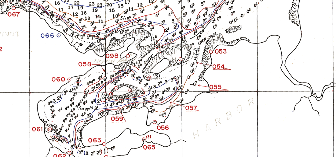 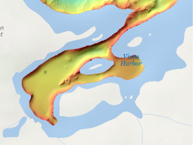 These surveys are available for download to the general public from NOAA’s National Geophysical Data Center (NGDC) website (click on the image above to be linked to the respective survey information page), as are all NOAA surveys. If you are planning on anchoring in small bays and have no local knowledge of them, I would encourage you to download the surveys of the area to get a more detailed picture of the bathymetry. They NGDC website provides a fairly easy to use graphical user interface, which allows you to select a point of interest and pull up links directly to the downloadable data for those areas:
https://maps.ngdc.noaa.gov/viewers/bathymetry/? Additionally, this article is critical of some cruising guide information, but notes that some other cruising guides provided better information that accurately described the entrance channel. They mention the US Coast Pilot, which is an official NOAA publication, only in passing as it is sited in these other cruising guides, but do not provide the full passage from the Coast Pilot. In the Coast Pilot you will find the following regarding Vixen Harbor: Vixen Harbor 0.8 mile east of Union Point, is about 0.4 mile long, with an even sand and mud bottom and an average depth of 4½ fathoms. The entrance channel, about 100 yards wide, has depths of only 2 fathoms. In entering, proceed carefully to the north of and close to the small islands in the entrance. Temporary anchorage for larger craft may be had in 16 fathoms, sand and gravel, 0.4 mile north of the small island in the entrance. The Coast Pilot is intended as a supplement to the nautical chart, which provides information on areas that is not easily depicted on the chart. The Coast Pilot can be dry and general in its descriptions, but utilizing the chart without consulting the Coast Pilot is only getting part of the picture. In this case, they take issue with the stated width and minimum depth in the passage of the Coast Pilot, but both values given were fairly close to those observed. The Coast Pilot does correctly indicate that the channel to enter the bay is to the north of the islands. I’m really not trying to beat up the people that wrote this article, but their thought process of “the chart is wrong” is indicative of the perception of a lot of mariners. I am hoping that this post will help you understand how the data on the charts is compiled, its limitations, and how you might get a more complete picture of an area. This is not to say that there aren’t errors on NOAA charts; I have found plenty. If you find one, NOAA would love to know about it. You can submit a chart discrepancy report via the “Report an Error” tab on the NOAA customer service website (https://www.nauticalcharts.noaa.gov/customer-service/assist/), but before you do, make sure that you have checked the source information thoroughly and provide as much supporting information as possible. Until next time, here’s wishing you fair winds and following seas.
1 Comment
5/8/2024 01:24:48
Restaurant is a place where cooked meals is offered to the public, and where human beings sit down down to devour it. It is likewise an area where human beings go to enjoy the time and to devour a meal. Some eating places are a chain, meaning that there are restaurants that have the identical name and serve the identical food. Leave a Reply. |
AuthorBrent Pounds has over a decade of experience in the maritime industry and has been involved in recreations boating since he was a child. See the About section for more detailed information. Archives
October 2016
Categories
All
|
 RSS Feed